How to Read Crypto Charts — A Complete Beginner to Advanced Guide
By Bitara Academy · June 2026 · 14 min read
The Chart Is Not Random Noise. It Is a Record of Human Decisions.
Every candlestick on a Bitcoin chart represents real people making real decisions under real pressure. When you look at a chart and see chaos, what you are actually seeing is the compressed decision-making of thousands of traders — fear, greed, conviction, and capitulation — recorded as price over time.
The traders who learn to read that record gain an enormous advantage over those who guess, follow social media calls, or enter positions with no framework at all. Chart reading will not make you right every time. Nothing does. But it gives you a structured way to understand what the market is doing — and more importantly, what it is likely to do next based on what buyers and sellers have demonstrated they care about.
This guide teaches you to read charts from zero. By the end you will understand candlesticks, trend structure, support and resistance, volume, and the correct way to use technical indicators. That is everything a competent trader needs to analyse any chart on Bitara.
Part 1: Understanding the Candlestick
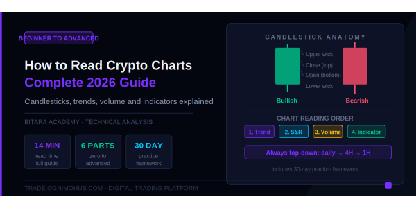
The candlestick is the fundamental unit of all chart analysis. Every chart is made of them. They originated in 18th-century Japanese rice trading and remain the global standard because they pack more information into a single visual element than any alternative.
What a Candle Shows You
Every single candle represents four data points for its time period:
- Open: The price at the start of the period
- Close: The price at the end of the period
- High: The highest price reached during the period
- Low: The lowest price reached during the period
The rectangular body of the candle shows the distance between open and close. The thin lines extending above and below the body — called wicks or shadows — show the high and low.
Colour tells you direction:
- A green (or white) candle means the close was higher than the open — buyers won that period
- A red (or black) candle means the close was lower than the open — sellers won that period
Reading Wicks: Where the Market Rejected Price
The wicks are where the real information lives, and most beginners ignore them.
A long upper wick tells you: price pushed significantly higher during that period, but buyers could not hold those levels. Sellers came in and pushed price back down. The wick is evidence of rejection at higher prices.
A long lower wick tells you: price pushed significantly lower during that period, but sellers could not hold those levels. Buyers came in and pushed price back up. The wick is evidence of rejection at lower prices — and often signals a potential reversal.
The hammer: A candle with a small body at the top and a very long lower wick. It appears after downtrends and signals that sellers pushed price down aggressively during the period, but buyers came in so forcefully that price closed near the high. This is a bullish rejection signal, particularly when it appears at a known support level.
The shooting star: The inverse — small body at the bottom, long upper wick. Appears after uptrends and signals bearish rejection at higher prices. Sellers overwhelmed buyers and price closed near the low of the period.
The doji: A candle where open and close are nearly identical, creating a tiny body with wicks on both sides. It represents indecision — neither buyers nor sellers won that period. After a strong trend, a doji signals that momentum is stalling and a reversal is possible. Wait for the next candle to confirm the direction.
Engulfing patterns: A bullish engulfing pattern is a small red candle followed by a larger green candle whose body completely covers the previous candle's body. It signals that buyers aggressively overwhelmed sellers. The bearish engulfing is the inverse — a small green candle consumed by a larger red one, signalling seller dominance.
Choosing the Right Timeframe
Every candlestick represents a time period. A 1-hour candle shows one hour of trading. A daily candle shows one day. Your choice of timeframe determines what type of trader you are analysing the market for.
The beginner mistake: Starting on 1-minute or 5-minute charts because the activity looks exciting. These timeframes are dominated by noise — random price fluctuations with no meaningful signal. Professional scalpers use them, but they have years of experience filtering signal from noise.
The correct starting framework:
- Daily chart: Always check this first. It shows the macro trend — the direction the market has been moving over weeks and months. Your individual trades should align with what the daily chart shows.
- 4-hour chart: Your primary working timeframe for swing trades and position analysis. Clean signal, manageable noise.
- 1-hour chart: Used for refining entry timing once you have identified a setup on the 4-hour or daily.
- 15-minute chart: For precise entry execution once a setup is confirmed on higher timeframes.
The rule: always analyse top-down. Start on the daily, identify the macro direction, then zoom in. Never analyse a 15-minute chart in isolation — it tells you nothing about whether you are trading with or against the broader trend.
Part 2: Trend Structure — The Most Important Concept in Chart Reading
What Is a Trend?
A trend is a directional bias in price movement over time. Markets do not move in straight lines. They move in waves — a series of advances and pullbacks (in an uptrend), or a series of declines and bounces (in a downtrend).
An uptrend is defined by: Higher Highs (HH) and Higher Lows (HL). Each rally peak is higher than the last. Each pullback trough is higher than the last.
A downtrend is defined by: Lower Highs (LH) and Lower Lows (LL). Each rally peak is lower than the last. Each decline trough is lower than the last.
A range (no trend) is characterised by: price oscillating between roughly the same high and low levels without making meaningful progress in either direction.
Why Trend Structure Matters
The single most profitable approach in trading is to trade with the trend. Buying in an uptrend and selling in a downtrend puts the statistical weight of market momentum behind your position. Trading against the trend — trying to catch reversals — is possible but requires significantly more skill and precision.
How to Identify a Trend Break
A trend is intact until it breaks. An uptrend breaks when price makes a Lower Low — a pullback that drops below the previous pullback low. This is the first signal that buyers are losing control.
Confirmation comes when price also makes a Lower High — the next rally fails to reach the previous rally peak. At this point, the structure has shifted from Higher Highs and Higher Lows to Lower Highs and Lower Lows. The uptrend is over. A new downtrend may be beginning.
This structure analysis — not any indicator — is the foundation of professional trend trading.
Part 3: Support and Resistance — Where the Market Has Memory
What They Are
Support is a price level where buyers have historically overwhelmed sellers. Price approached this level, buyers came in, and price bounced upward. The market has demonstrated that at this level, demand exceeds supply.
Resistance is the opposite: a price level where sellers have historically overwhelmed buyers. Price approached this level, sellers came in, and price reversed downward. The market has demonstrated that at this level, supply exceeds demand.
These levels matter because the market has memory. The same participants who bought at support the first time will often buy again when price returns. The same institutions that sold at resistance will often sell again when price returns. This collective memory creates repeating reactions at the same price levels.
How to Identify Them
On your chart, look for price levels where price has reversed multiple times. The more times price has reacted at a level, the more significant that level is. A level that has been tested and held three or four times is a major support or resistance.
Horizontal levels are the most reliable. Trendlines — diagonal lines connecting a series of higher lows in an uptrend — are secondary but useful.
The Support-Resistance Flip
One of the most important concepts in chart analysis: when price breaks through a support level convincingly, that support often becomes new resistance. When price breaks through a resistance level, that resistance often becomes new support.
This "flip" happens because the buyers who held a support level are now trapped below the breakdown. When price returns to that level, they use it as an opportunity to exit their losing positions — creating selling pressure at the former support level, which now acts as resistance.
Part 4: Volume — The Lie Detector
Volume is the number of units traded during a specific time period. It is displayed as vertical bars at the bottom of most charts.
Volume answers the question that price cannot answer alone: Is this move real?
A price breakout above a resistance level on high volume means: many participants drove this move. The conviction is real. The breakout is more likely to sustain.
A price breakout above a resistance level on low volume means: few participants drove this move. It may be a false breakout — price pushed through on thin participation and is likely to fail and reverse.
The practical rules:
A genuine breakout shows volume expansion of 1.5 to 2 times the recent average. Genuine breakouts show volume expansion — significantly more trading activity than average as price moves through the key level.
A fake breakout — called a "fakeout" — typically shows low volume during the breakout, followed by a quick reversal back below the level, often with long wicks on the breakout candle.
Always wait for a candle to close above resistance before treating the breakout as confirmed. A wick through resistance with a close below it is not a breakout. It is a test.
Volume divergence: When price is making higher highs but volume is declining on each rally, this is bearish divergence. The trend is continuing but with fewer participants each time — momentum is weakening. This often precedes a trend reversal.
Part 5: Technical Indicators — Tools, Not Oracles
The most important thing to understand about technical indicators: they are lagging. They are calculated from past price data. They do not predict the future. They help you describe what is currently happening and give you a framework for making higher-probability decisions.
Most beginners add too many indicators and end up paralysed. One indicator says buy. Another says sell. Professional traders use fewer indicators, not more.
The optimal beginner setup is: one trend indicator, one momentum indicator, and volume.
The RSI (Relative Strength Index)
RSI measures momentum — how quickly and strongly price has been moving. It oscillates between 0 and 100.
The standard interpretation:
- Above 70: overbought — the recent rally may be overextended and due for a pullback
- Below 30: oversold — the recent decline may be overextended and due for a bounce
The beginner mistake: Trading RSI overbought and oversold levels in isolation. In a strong uptrend, RSI can stay above 70 for extended periods. In a strong downtrend, it can stay below 30. Selling something simply because RSI is above 70 in a bull run will cause you to miss most of the move.
The correct use: RSI is most powerful for spotting divergence. If price makes a new high but RSI makes a lower high, this is bearish divergence — price is moving up but momentum is weakening. This signal, confirmed with other analysis, is a high-quality warning of a potential reversal.
MACD (Moving Average Convergence Divergence)
MACD measures the relationship between two exponential moving averages: the 12-period EMA and the 26-period EMA. A signal line (9-period EMA of MACD) is overlaid, and a histogram shows the distance between MACD and its signal line.
The standard interpretation:
- When the MACD line crosses above the signal line: bullish momentum shift
- When the MACD line crosses below the signal line: bearish momentum shift
- When the histogram shrinks toward zero: current momentum is fading
The beginner mistake: Taking every MACD crossover as a trade signal. In choppy, sideways markets, MACD generates constant false crossovers as price oscillates with no direction.
The correct use: MACD is most reliable in trending markets. In a clear uptrend, a MACD bullish crossover above the zero line is a high-quality signal. Below zero in a downtrend, bearish crossovers are reliable. Use MACD for trend confirmation, not for predicting reversals.
Moving Averages
A moving average smooths price data by calculating the average price over a specific number of periods. The 50-period moving average and the 200-period moving average are the most widely watched in crypto.
Key relationships:
- Price above the 200 MA: the long-term trend is bullish
- Price below the 200 MA: the long-term trend is bearish
- The 50 MA crossing above the 200 MA: the "Golden Cross" — a widely watched bullish signal
- The 50 MA crossing below the 200 MA: the "Death Cross" — a widely watched bearish signal
Many institutional traders view the 200-day moving average as the line between bullish and bearish macro conditions for Bitcoin.
The beginner mistake: Using moving averages as precise buy and sell signals. They are trend context tools, not entry triggers. Use them to understand whether you are trading with or against the macro trend.
Part 6: Putting It All Together — The Chart Reading Process
Here is the step-by-step process professional traders use before entering any trade:
Step 1 — Check the daily chart for macro trend. Are you in an uptrend (HH and HL), a downtrend (LH and LL), or a range? This determines your directional bias. Only take long trades in uptrends. Only take short trades in downtrends. Avoid trading ranges until you are experienced.
Step 2 — Identify key support and resistance levels. Mark the major levels on the daily chart. These are the zones where the market has consistently reacted. These are your targets and your stop-loss reference points.
Step 3 — Check volume context. Is recent price action backed by strong volume or weak volume? Strong volume at a breakout validates it. Weak volume makes it suspicious.
Step 4 — Drop to the 4-hour chart. Confirm the structure matches the daily chart direction. Look for a setup near a key support or resistance level that aligns with the macro trend.
Step 5 — Use your indicator(s) for confirmation. Check RSI for divergence or momentum confirmation. Check MACD for crossover alignment. These confirm — they do not initiate.
Step 6 — Define your trade levels before entering. Entry price. Stop-loss (the level that invalidates your thesis). Take-profit (your target). If the risk-to-reward ratio is less than 1:2 — meaning your potential loss is more than half your potential gain — the trade is not worth taking.
Step 7 — Execute and detach. The trade is placed with stop-loss and take-profit orders set. Your job is done. The market will either validate your analysis or invalidate it. Do not monitor it every minute.
Common Mistakes That Cost Beginners the Most
Using 1-minute charts. The noise-to-signal ratio is too high. The moves you see have no predictive value. Start on the daily and 4-hour.
Adding too many indicators. Indicator overload produces contradictory signals and analysis paralysis. More is not better. Choose one trend tool, one momentum tool, and volume — and stay consistent.
Treating indicators as signals in isolation. An RSI reading of 72 is not a sell signal. A MACD crossover is not a buy signal. These are data points that need confirmation from price structure, volume, and higher timeframe context.
Not defining stop-loss before entering. Every trade needs a pre-defined level where you admit you were wrong and exit. Without it, losses become open-ended.
Chasing breakouts late. By the time a breakout is obvious enough to feel safe, you are entering after the move. The correct approach is to identify the setup in advance — near support with your analysis prepared — and enter as price approaches the level, not after it has already moved 10%.
Ignoring higher timeframe context. A buy signal on the 15-minute chart means nothing if the daily chart is in a confirmed downtrend. Always trade in the direction of the larger timeframe.
Practice Framework for New Traders
Week 1–2: Open TradingView. Open BTC/USDT on the daily chart. Practice identifying uptrend, downtrend, and range on historical data. Mark every major support and resistance level. Do this 30 minutes per day.
Week 3–4: Add volume. Practice identifying breakouts and asking: was this breakout backed by volume or not? Revisit historical breakouts and note which sustained and which reversed. Look for the volume pattern.
Week 5–6: Add RSI. Practice finding divergences on the 4-hour chart — places where price made a new high but RSI did not. Check what happened next.
Week 7–8: Add MACD. Practice confirming trend direction. In uptrends, look for MACD crossovers above zero as entry timing. In downtrends, look for crosses below zero as short entry timing.
Month 3 onward: Start paper trading your setups on Bitara without real capital. Track every trade — entry, stop, target, and outcome. Review your journal weekly. Your own trade data is the most valuable feedback available.
Disclaimer: This content is for educational purposes only. Chart patterns reflect probability, not certainty. Always use risk management including stop-losses and position sizing. Never invest more than you can afford to lose.
Share This Post
By Bitara Academy · June 2026 · 14 min read
The Chart Is Not Random Noise. It Is a Record of Human Decisions.
Every candlestick on a Bitcoin chart represents real people making real decisions under real pressure. When you look at a chart and see chaos, what you are actually seeing is the compressed decision-making of thousands of traders — fear, greed, conviction, and capitulation — recorded as price over time.
The traders who learn to read that record gain an enormous advantage over those who guess, follow social media calls, or enter positions with no framework at all. Chart reading will not make you right every time. Nothing does. But it gives you a structured way to understand what the market is doing — and more importantly, what it is likely to do next based on what buyers and sellers have demonstrated they care about.
This guide teaches you to read charts from zero. By the end you will understand candlesticks, trend structure, support and resistance, volume, and the correct way to use technical indicators. That is everything a competent trader needs to analyse any chart on Bitara.
Part 1: Understanding the Candlestick
The candlestick is the fundamental unit of all chart analysis. Every chart is made of them. They originated in 18th-century Japanese rice trading and remain the global standard because they pack more information into a single visual element than any alternative.
What a Candle Shows You
Every single candle represents four data points for its time period:
- Open: The price at the start of the period
- Close: The price at the end of the period
- High: The highest price reached during the period
- Low: The lowest price reached during the period
The rectangular body of the candle shows the distance between open and close. The thin lines extending above and below the body — called wicks or shadows — show the high and low.
Colour tells you direction:
- A green (or white) candle means the close was higher than the open — buyers won that period
- A red (or black) candle means the close was lower than the open — sellers won that period
Reading Wicks: Where the Market Rejected Price
The wicks are where the real information lives, and most beginners ignore them.
A long upper wick tells you: price pushed significantly higher during that period, but buyers could not hold those levels. Sellers came in and pushed price back down. The wick is evidence of rejection at higher prices.
A long lower wick tells you: price pushed significantly lower during that period, but sellers could not hold those levels. Buyers came in and pushed price back up. The wick is evidence of rejection at lower prices — and often signals a potential reversal.
The hammer: A candle with a small body at the top and a very long lower wick. It appears after downtrends and signals that sellers pushed price down aggressively during the period, but buyers came in so forcefully that price closed near the high. This is a bullish rejection signal, particularly when it appears at a known support level.
The shooting star: The inverse — small body at the bottom, long upper wick. Appears after uptrends and signals bearish rejection at higher prices. Sellers overwhelmed buyers and price closed near the low of the period.
The doji: A candle where open and close are nearly identical, creating a tiny body with wicks on both sides. It represents indecision — neither buyers nor sellers won that period. After a strong trend, a doji signals that momentum is stalling and a reversal is possible. Wait for the next candle to confirm the direction.
Engulfing patterns: A bullish engulfing pattern is a small red candle followed by a larger green candle whose body completely covers the previous candle's body. It signals that buyers aggressively overwhelmed sellers. The bearish engulfing is the inverse — a small green candle consumed by a larger red one, signalling seller dominance.
Choosing the Right Timeframe
Every candlestick represents a time period. A 1-hour candle shows one hour of trading. A daily candle shows one day. Your choice of timeframe determines what type of trader you are analysing the market for.
The beginner mistake: Starting on 1-minute or 5-minute charts because the activity looks exciting. These timeframes are dominated by noise — random price fluctuations with no meaningful signal. Professional scalpers use them, but they have years of experience filtering signal from noise.
The correct starting framework:
- Daily chart: Always check this first. It shows the macro trend — the direction the market has been moving over weeks and months. Your individual trades should align with what the daily chart shows.
- 4-hour chart: Your primary working timeframe for swing trades and position analysis. Clean signal, manageable noise.
- 1-hour chart: Used for refining entry timing once you have identified a setup on the 4-hour or daily.
- 15-minute chart: For precise entry execution once a setup is confirmed on higher timeframes.
The rule: always analyse top-down. Start on the daily, identify the macro direction, then zoom in. Never analyse a 15-minute chart in isolation — it tells you nothing about whether you are trading with or against the broader trend.
Part 2: Trend Structure — The Most Important Concept in Chart Reading
What Is a Trend?
A trend is a directional bias in price movement over time. Markets do not move in straight lines. They move in waves — a series of advances and pullbacks (in an uptrend), or a series of declines and bounces (in a downtrend).
An uptrend is defined by: Higher Highs (HH) and Higher Lows (HL). Each rally peak is higher than the last. Each pullback trough is higher than the last.
A downtrend is defined by: Lower Highs (LH) and Lower Lows (LL). Each rally peak is lower than the last. Each decline trough is lower than the last.
A range (no trend) is characterised by: price oscillating between roughly the same high and low levels without making meaningful progress in either direction.
Why Trend Structure Matters
The single most profitable approach in trading is to trade with the trend. Buying in an uptrend and selling in a downtrend puts the statistical weight of market momentum behind your position. Trading against the trend — trying to catch reversals — is possible but requires significantly more skill and precision.
How to Identify a Trend Break
A trend is intact until it breaks. An uptrend breaks when price makes a Lower Low — a pullback that drops below the previous pullback low. This is the first signal that buyers are losing control.
Confirmation comes when price also makes a Lower High — the next rally fails to reach the previous rally peak. At this point, the structure has shifted from Higher Highs and Higher Lows to Lower Highs and Lower Lows. The uptrend is over. A new downtrend may be beginning.
This structure analysis — not any indicator — is the foundation of professional trend trading.
Part 3: Support and Resistance — Where the Market Has Memory
What They Are
Support is a price level where buyers have historically overwhelmed sellers. Price approached this level, buyers came in, and price bounced upward. The market has demonstrated that at this level, demand exceeds supply.
Resistance is the opposite: a price level where sellers have historically overwhelmed buyers. Price approached this level, sellers came in, and price reversed downward. The market has demonstrated that at this level, supply exceeds demand.
These levels matter because the market has memory. The same participants who bought at support the first time will often buy again when price returns. The same institutions that sold at resistance will often sell again when price returns. This collective memory creates repeating reactions at the same price levels.
How to Identify Them
On your chart, look for price levels where price has reversed multiple times. The more times price has reacted at a level, the more significant that level is. A level that has been tested and held three or four times is a major support or resistance.
Horizontal levels are the most reliable. Trendlines — diagonal lines connecting a series of higher lows in an uptrend — are secondary but useful.
The Support-Resistance Flip
One of the most important concepts in chart analysis: when price breaks through a support level convincingly, that support often becomes new resistance. When price breaks through a resistance level, that resistance often becomes new support.
This "flip" happens because the buyers who held a support level are now trapped below the breakdown. When price returns to that level, they use it as an opportunity to exit their losing positions — creating selling pressure at the former support level, which now acts as resistance.
Part 4: Volume — The Lie Detector
Volume is the number of units traded during a specific time period. It is displayed as vertical bars at the bottom of most charts.
Volume answers the question that price cannot answer alone: Is this move real?
A price breakout above a resistance level on high volume means: many participants drove this move. The conviction is real. The breakout is more likely to sustain.
A price breakout above a resistance level on low volume means: few participants drove this move. It may be a false breakout — price pushed through on thin participation and is likely to fail and reverse.
The practical rules:
A genuine breakout shows volume expansion of 1.5 to 2 times the recent average. Genuine breakouts show volume expansion — significantly more trading activity than average as price moves through the key level.
A fake breakout — called a "fakeout" — typically shows low volume during the breakout, followed by a quick reversal back below the level, often with long wicks on the breakout candle.
Always wait for a candle to close above resistance before treating the breakout as confirmed. A wick through resistance with a close below it is not a breakout. It is a test.
Volume divergence: When price is making higher highs but volume is declining on each rally, this is bearish divergence. The trend is continuing but with fewer participants each time — momentum is weakening. This often precedes a trend reversal.
Part 5: Technical Indicators — Tools, Not Oracles
The most important thing to understand about technical indicators: they are lagging. They are calculated from past price data. They do not predict the future. They help you describe what is currently happening and give you a framework for making higher-probability decisions.
Most beginners add too many indicators and end up paralysed. One indicator says buy. Another says sell. Professional traders use fewer indicators, not more.
The optimal beginner setup is: one trend indicator, one momentum indicator, and volume.
The RSI (Relative Strength Index)
RSI measures momentum — how quickly and strongly price has been moving. It oscillates between 0 and 100.
The standard interpretation:
- Above 70: overbought — the recent rally may be overextended and due for a pullback
- Below 30: oversold — the recent decline may be overextended and due for a bounce
The beginner mistake: Trading RSI overbought and oversold levels in isolation. In a strong uptrend, RSI can stay above 70 for extended periods. In a strong downtrend, it can stay below 30. Selling something simply because RSI is above 70 in a bull run will cause you to miss most of the move.
The correct use: RSI is most powerful for spotting divergence. If price makes a new high but RSI makes a lower high, this is bearish divergence — price is moving up but momentum is weakening. This signal, confirmed with other analysis, is a high-quality warning of a potential reversal.
MACD (Moving Average Convergence Divergence)
MACD measures the relationship between two exponential moving averages: the 12-period EMA and the 26-period EMA. A signal line (9-period EMA of MACD) is overlaid, and a histogram shows the distance between MACD and its signal line.
The standard interpretation:
- When the MACD line crosses above the signal line: bullish momentum shift
- When the MACD line crosses below the signal line: bearish momentum shift
- When the histogram shrinks toward zero: current momentum is fading
The beginner mistake: Taking every MACD crossover as a trade signal. In choppy, sideways markets, MACD generates constant false crossovers as price oscillates with no direction.
The correct use: MACD is most reliable in trending markets. In a clear uptrend, a MACD bullish crossover above the zero line is a high-quality signal. Below zero in a downtrend, bearish crossovers are reliable. Use MACD for trend confirmation, not for predicting reversals.
Moving Averages
A moving average smooths price data by calculating the average price over a specific number of periods. The 50-period moving average and the 200-period moving average are the most widely watched in crypto.
Key relationships:
- Price above the 200 MA: the long-term trend is bullish
- Price below the 200 MA: the long-term trend is bearish
- The 50 MA crossing above the 200 MA: the "Golden Cross" — a widely watched bullish signal
- The 50 MA crossing below the 200 MA: the "Death Cross" — a widely watched bearish signal
Many institutional traders view the 200-day moving average as the line between bullish and bearish macro conditions for Bitcoin.
The beginner mistake: Using moving averages as precise buy and sell signals. They are trend context tools, not entry triggers. Use them to understand whether you are trading with or against the macro trend.
Part 6: Putting It All Together — The Chart Reading Process
Here is the step-by-step process professional traders use before entering any trade:
Step 1 — Check the daily chart for macro trend. Are you in an uptrend (HH and HL), a downtrend (LH and LL), or a range? This determines your directional bias. Only take long trades in uptrends. Only take short trades in downtrends. Avoid trading ranges until you are experienced.
Step 2 — Identify key support and resistance levels. Mark the major levels on the daily chart. These are the zones where the market has consistently reacted. These are your targets and your stop-loss reference points.
Step 3 — Check volume context. Is recent price action backed by strong volume or weak volume? Strong volume at a breakout validates it. Weak volume makes it suspicious.
Step 4 — Drop to the 4-hour chart. Confirm the structure matches the daily chart direction. Look for a setup near a key support or resistance level that aligns with the macro trend.
Step 5 — Use your indicator(s) for confirmation. Check RSI for divergence or momentum confirmation. Check MACD for crossover alignment. These confirm — they do not initiate.
Step 6 — Define your trade levels before entering. Entry price. Stop-loss (the level that invalidates your thesis). Take-profit (your target). If the risk-to-reward ratio is less than 1:2 — meaning your potential loss is more than half your potential gain — the trade is not worth taking.
Step 7 — Execute and detach. The trade is placed with stop-loss and take-profit orders set. Your job is done. The market will either validate your analysis or invalidate it. Do not monitor it every minute.
Common Mistakes That Cost Beginners the Most
Using 1-minute charts. The noise-to-signal ratio is too high. The moves you see have no predictive value. Start on the daily and 4-hour.
Adding too many indicators. Indicator overload produces contradictory signals and analysis paralysis. More is not better. Choose one trend tool, one momentum tool, and volume — and stay consistent.
Treating indicators as signals in isolation. An RSI reading of 72 is not a sell signal. A MACD crossover is not a buy signal. These are data points that need confirmation from price structure, volume, and higher timeframe context.
Not defining stop-loss before entering. Every trade needs a pre-defined level where you admit you were wrong and exit. Without it, losses become open-ended.
Chasing breakouts late. By the time a breakout is obvious enough to feel safe, you are entering after the move. The correct approach is to identify the setup in advance — near support with your analysis prepared — and enter as price approaches the level, not after it has already moved 10%.
Ignoring higher timeframe context. A buy signal on the 15-minute chart means nothing if the daily chart is in a confirmed downtrend. Always trade in the direction of the larger timeframe.
Practice Framework for New Traders
Week 1–2: Open TradingView. Open BTC/USDT on the daily chart. Practice identifying uptrend, downtrend, and range on historical data. Mark every major support and resistance level. Do this 30 minutes per day.
Week 3–4: Add volume. Practice identifying breakouts and asking: was this breakout backed by volume or not? Revisit historical breakouts and note which sustained and which reversed. Look for the volume pattern.
Week 5–6: Add RSI. Practice finding divergences on the 4-hour chart — places where price made a new high but RSI did not. Check what happened next.
Week 7–8: Add MACD. Practice confirming trend direction. In uptrends, look for MACD crossovers above zero as entry timing. In downtrends, look for crosses below zero as short entry timing.
Month 3 onward: Start paper trading your setups on Bitara without real capital. Track every trade — entry, stop, target, and outcome. Review your journal weekly. Your own trade data is the most valuable feedback available.
Disclaimer: This content is for educational purposes only. Chart patterns reflect probability, not certainty. Always use risk management including stop-losses and position sizing. Never invest more than you can afford to lose.